Wednesday, February 29, 2012

HGTV 2012 Dream Home: Top Trends Spotted - Part 3

Now onto the next rooms of the HGTV 2012 Dream Home: Top Trends Spotted - Part 3. Lets explore the fully loaded kitchen and stylish dining room both sporting the trends of this new year. The kitchen and dining room are in one combined space but together showcase one of our trends we've been discussing; the modern-traditional style.

Photo courtesy of www.HGTV.com
The kitchen pulls in a lot of the modern feel with the clean lines, stainless steel accents and cohesive color scheme, while the dining room is more traditional. Contrary to popular belief kitchens in 2012 do not incorporate the "work triangle".  Now-a-days it's all about having different prep and cooking areas. By doing this you can have many people in the kitchen all performing different functions.  As you can see this kitchen accomplishes that with the use of colors and proper space planning. The quartz counter-tops are tone-on-tone with their cabinets; white on the perimeter and oatmeal on the island.  A current trend is to split-up the different areas as seen here with the island and perimeter cabinets showcasing different colors that blend to make one beautiful color scheme.  

Photo courtesy of www.HGTV.com
The stone work with the wood lintel separates the kitchen from the great room; however, the flowing Brazilian walnut wood floors and continued color scheme help keep the spaces unified.

Photo courtesy of www.HGTV.com
As I mentioned earlier this kitchen is loaded. Convenient prep refrigerated food drawers, oven-microwave-warming drawer combo, floor to ceiling cabinetry, and a full separate fridge and freezer that flank the bank of cabinets on the far wall - a continued trend we'll see throughout 2012.   The entire kitchen is functional and useful. It's amazing what can happen in a well designed space.

Photo courtesy of HGTV.com
A 2x2 blue square tile backsplash divides the slab style cabinet doors and gives us a slight throw back to the 1970's kitchens of the past that we'll see more of over the next few years.  Note the full width cabinet pulls on both the drawers and cabinets.  This is a trend you'll see throughout 2012.  The large pulls all placed horizontally keep the eye moving and allow for a modern and cohesive look with little fuss.

Photo courtesy of HGTV.com
A great take on the "pot rack" idea. Exposed shelves create easy access for your pots, pans and appliances.

Now onto the dining room...

Photo courtesy of HGTV.com
The dining room design leans more towards a traditional look and blends both formal and informal elements. A repeated trend here is the ikat pattern fabric that adds interest around that table all while tying in the blue tile backsplash and the ikat pillows in the great room.

Photo courtesy of www.HGTV.com
One thing I love about the dining chairs are the Windsor chairs placed at the head of the table instead of a typical upholstered chair. Designer, Linda Woodrum, said on HGTV that she selected these with a purpose saying, "I think that the Windsor chair, especially when it's blow up like that, makes a very interesting architectural statement."

Photo courtesy of www.HGTV.com
A fun detail in the room that adds a little bit of shimmer was the pair of Ethan Allen ivory temple jars flanking the back wall, they are brought up to eye level with the large wooden pillars - simple and beautiful.

Photo courtesy of www.HGTV.com
The dining table is surrounded by three large, picturesque windows which really help bring the outdoors in and make the dining experience serene and delightful.


Photo courtesy of www.HGTV.com
Instead of using greenery or accessories to dress the table Linda let the light do all the work, these large demijohn jars give the table a different look through out the day as they reflect and shine the light  as it passes through them.

Let us know what your favorite element was in this kitchen and dining room.

Thursday, February 23, 2012

HGTV 2012 Dream Home: Top Trends Spotted - Part 2

Welcome back to the HGTV 2012 Dream Home: Top Trends Spotted - Part 2 where we explore the first bedroom and the trends of this new year. 

The guest bedroom entry is right off the great room and it is pure serenity. A series of lanterns welcome you into the guest wing.  This is a great idea to utilize everyday items like this instead of just a picture on every wall.

Photo courtesy of HGTV.com
Soft blue-green tones mixed with browns and white make this a splendid bedroom to be a guest in.

Photo courtesy of HGTV.com
I fell in love with the striped draperies that were repeated on the other side of the room in the with the plush euro pillows.


A darling Chippendale style bed positioned in-between to hanging pendants for bedside light.  You'll note in this room as well as all of the other bedrooms there is no matching bedroom furniture set, because the world of matchy-matchy is definitely out.  A good rule of thumb is to never buy a full bedroom set, or living room set for that matter.  In 2012 it's key to keep interest in a room and longevity in your furniture pieces by pairing items together.  Linda Woodrum, the interior designer, kept the interest flowing in this room with items like the woven stool, that can be utilized as a desk chair, or a place to put you're socks and shoes on.  Note that another one is by the chairs as a side table and one could use it as an ottoman.

Photo courtesy of HGTV.com

Again, perfect styling of a bedside table. It's great how the art is not the center of attention and positioned in the middle, instead it's part of the whole with all of the items being a collection - remember the eclectic look trend blog, yes, here it is in real life action!

Photo courtesy of HGTV.com
One can't have a guest bedroom without offering a full service atmosphere.  And Linda placed this woven tray perfectly on an angle at the foot of the bed.

Photo courtesy of HGTV.com
And off of the bedroom is the perfect little guest bathroom.

Photo courtesy of HGTV.com
One of the practical features of this house was that they used porclain and ceramic tiles in the showers instead of doing full stone like travertine and marble everywhere.  This kept costs down and I don't think they sacrificed much in the way of style, it works with the overall atmosphere of the home and fits in perfectly still.  Extra long hardware pulls spanning the cabinet face is a continued trend in 2012 and gives these shaker style cabinets a modern feel.

Photo courtesy of HGTV.com
I absolutely fell in love with this amazing orchid floral and it's pop of fushia.  It is just decadent in this serene bathroom.  It's always nice to bring this kind of a pop to any room,, especially one as serene as this one. Adding a big bathroom tray like this to put all of your little items on gives a little bit more shimmer to the bathroom and then you can just pick it up and move it on cleaning day.  

Photo courtesy of HGTV.com
The light cream cabinets are a continued trend in 2012 and will only gain in popularity.  By having such a neutral light cabinet it allows you to pull in all kinds of colors and can really let you experiment with your paint.  Utilizing pocket doors like these used for this closet are a great use of space.  A lot of people are afraid of pocket doors, but as long as you get a good brand you have nothing to worry about, and they are so functional when you need to save on space.

What are your thoughts on this guest room, would you love it in your house?

Tuesday, February 21, 2012

HGTV 2012 Dream Home: Top Trends Spotted - Part 1

We were excited to be invited by our friends at Ethan Allen last week to tour the 2012 HGTV Dream Home in Midway, Utah.  It was a great experience to see this home up close and personal. If you've been keeping up on our 2012 Trends this year, you'll be ahead of the curve and will see those great trends popping out all over this home. Interior Designer, Linda Woodrum did an amazing job designing this home from the gorgeous Ethan Allen furnishings and accessories down to the art hung on the walls by many local artists.

Since Linda Woodrum, was very careful to make sure that this 2012 dream home represented the latest and greatest.  I thought it was only fitting for us to give you a breakdown of how she incorporated the trends of 2012.  You can tour the complete home on your own at http://www.hgtv.com/dream-home/index.html but of course you'll miss me showing you examples of the trends, so just come along with me now and I'll walk you through it!

Part 1: Exterior, Entry, & Great Room

While this was definitely a dream home I thought it was still very practical.  I love homes that utilize their square footage and are not enormous just to be enormous. I thought this home did just that; with it's 4,000 square feet it contained 3 bedrooms, a 2 car garage, and lots of living space: a great room, large kitchen, 3 outdoor gathering areas, a game room, and dressing room. There's lots of room to have your family and friends over.   
Photo courtesy of HGTV.com
Beautiful exterior, complete with the winners new car parked out front.
Situated between two lots you have plenty of open land and yard space to enjoy the rambling Provo River that flows just behind the property. The exterior of the 4,000 sq ft. home sets the precedence of the Dream Home's color scheme.  Linda chose a grey color scheme with grey blue and grey brown accents.  The home's design was inspired by it's surroundings. During an interview Linda said the color scheme was inspired by the blue sky, the river, white snow, and how the mountains turn blue during the winter afternoons.  Being a resident of Utah myself I can attest that Linda is spot-on.

A great attribute about ths house is how it pulls from both traditional and modern elements to make a completely comfortable and up-to-date home.  Even on the exterior we have a traditional carriage houe garage door with corrugated steel shed roofs.

Photo courtesy of HGTV.com
Here is the entryway , I loved the staircase with its painted risers and wood stained treads completed with this custom hand rail.  It mixes the traditional styling with a simple clean modern look.

Photo courtesy of HGTV.com
Fabulous box light fixture bringing the natural elements in. 

Photo courtesy of HGTV.com
I love this simple oversized handrail with the modern glass. Think outside of the box when it comes to stair railing; eveyone doesn't have to have the same iron or wood balusters that are all too common.

On to the great room:
Photo courtesy of HGTV.com
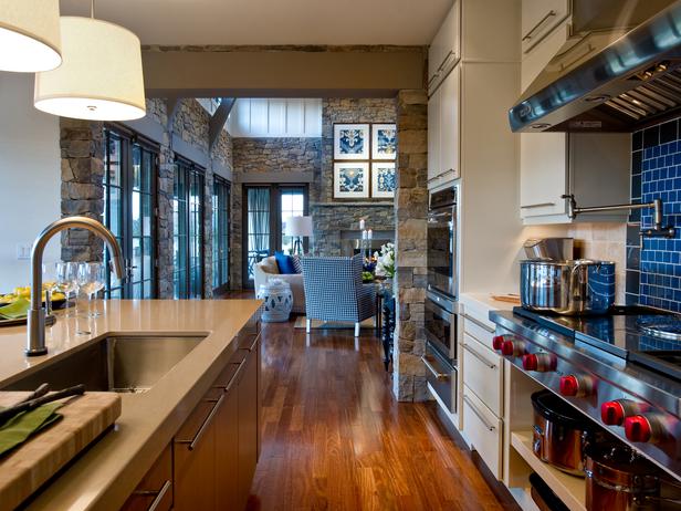
I love the blue tones in this room and in person the stone walls are a touch lighter and have warm tones that tie them into the gorgeous Brazilian Chestnut wood floors that flow throughout the home.  The great room is full of symmetry, it flows through the architecture in the series of french doors that open to the vistas in the front and the back of the house and also in the furniture and art. This is the perfect room for entertaining as you could open all of the doors to bring the party inside and out, front and back. Now that's how I like to entertain!


Photo courtesy of HGTV.com

The custom trusses with the perfect steel cable detail lie in-between the clerestory windows.

Photo courtesy of HGTV.com
The large garden stools used as end tables are the perfect choice, they allow a nice flow in the room because if average sized rectangular end tables were used you would barely be able to get into the seating area. Garden stools are a huge trend in 2012.  You'll see them everywhere and they are so versatile.

Photo courtesy of HGTV.com

Now notice the Ikat art prints that were chosen to be displayed on the fireplace. We haven't covered the trend of Ikat yet but it's a big one.  Ikat, pronounced "ee-kot" is a process where they tie-dye the yarn before weaving which allows for a warped, bleeded look. You can tell an ikat print by its feathered edges.  This fabric pattern has become popular over the last couple of years and it is here to stay for a while. I love how Linda hung the art above the fireplace right next to each other instead of spacing them a few inches apart, which from a functional standpoint works perfectly as I'm sure it would have been almost impossible to hang them straight on the stone wall.

Photo courtesy of HGTV.com
Photo couresy of hgtv.com
The key to having the perfect room in 2012 is layering the textures.  Here we see a twill fabric sofa with ticking stripes and ikat print pillows on it balanced by the beautifully clad houndstooth chairs.  Everything down to the smallest details was taken into consideration for the design of this space. I also love how Linda styled the cocktail table, just perfect. Again with the layering of the wood and glass and woven grass tray every item has it's place and adds to the feel of the room.

If you peek to the doorway to the left of the grand fireplace that's the entry to the first bedroom, which we'll talk about on our next blog… so stay tuned!

Wednesday, February 15, 2012

We're excited to tour the HGTV Dream Home!

We're super-duper excited because we get to go tour the 2012 HGTV Dream Home! Wahoo!!  Located only 30 minutes away from The Design House in Midway, Utah this home is a dream come true from the beautiful surroundings down to the last detail and we can't wait to see it up close and in person!  We'll report back the details as much as we can, but in the meantime check out the website and TV episodes of this amazing home.  You only have two days left to enter to win this awesome beauty which is valued at over a $2 million prize so you better get on it!

http://www.hgtv.com/hgtv-dream-home-2012-giveaway-enter/package/index.html

Tuesday, February 14, 2012

A Kitchen Transformation

A little bit ago we finished a kitchen remodel. 
This kitchen went from blah yellow oak everywhere to gorgeous deep wood tones and a beautiful granite countertop complemented by gorgeous new walnut wood flooring, paint, tile, and lighting; all tied together with a pop of color in the roman shade.


Since my clients really liked the functionality of their space I kept the same basic layout while creating a beautiful new kitchen that encompassed all of their wants and needs. Here are the sketches I made for my clients at the beginning of the project.

Floor Plan
Elevations of the Cabinetry 
 Our clients absolutely love their new kitchen! The reclaimed walnut wood flooring is laid throughout the entire main floor and we helped select new paint colors for all the walls on the main floor as well to give their home a flowing, cohesive look. 

Closeup of the new floor
You might remember these floors from a post I did a few months ago on reclaimed wood floors.  The reclaimed walnut wood flooring has a circle-sawn distressing with a beautiful coffee-caramel colored stain.  I chose a 3", 5" and 8" plank to add more interest, not that this floor needed any more interest, but it really helps create a more natural feel and since we continued this flooring throughout the whole first story there is a lot of square footage and having the distressing and varied plank sizes allows for longevity. The distressing, knots, and plank variation all add to the reclaimed look and it is simply gorgeous! Here are the dramatic before and afters. Enjoy!

Before
After
Adding paneling to match the cabinets on solid surfaces like the side of a cabinet or under the counter overhang really gives you a more finished and expensive look. The cabinetry was created and installed by the talented Peterson Woodworks out of Lindon. Jon, the owner, was great to work with and really delivered a beautiful product in making my design come to life.


Before
After
Before
This monstrous fluorescent fixture had to go and we replaced it with
 sleek recessed cans to offer general lighting throughout the kitchen.  
After
After
Before
After
After
After
A close up of our beautiful subway tile backsplash! We didn't need anything "flashy" because the granite, custom cabinets and wood flooring were the stars of this project. Adding a simple, elegant crackled subway tile was the perfect touch. Mike with Maxim Tile installed our tile backsplash and once again, is another great company to work with. Everything really came together perfectly for this project. 

Before
After
Before
After
Before
After
Before
After
We added a few glass doors along the top cabinets for an intriguing look and accent lighting installed by Black Diamond Electric.  The custom cabinetry valance above the roman shade also gives the space a cohesive look.


And last, but certainly not least, our "cherry on top" was this whimsical roman shade which was the finishing touch to our kitchen remodel. It added the perfect pop of color and added in just a touch of fun that the space needed. This project was absolutely delightful and the clients were wonderful to work with and very happy with the results; they feel like they have a brand new home! And that's why we love what we do!